

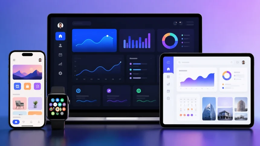
User Interface: Meaning, Types & Real Examples
A user interface, commonly shortened to UI, is the point where a person interacts with a computer, website, mobile application, machine, or other digital system. Buttons, menus, icons, screens, search bars, forms, keyboards, voice commands, and even gestures can all form part of a user interface. When you unlock a smartphone, select a movie on a streaming service, withdraw money from an ATM, or change settings on a smart television, you are using a UI. A well-designed interface helps people understand what they can do and makes actions feel predictable. Poor interfaces create confusion, errors, frustration, and unnecessary effort, even when the underlying technology works perfectly.
User interfaces are not limited to colorful websites and mobile apps. A command-line terminal, ATM keypad, car dashboard, supermarket self-checkout, voice assistant, smartwatch, and industrial control panel all provide ways for people to interact with technology. Different interfaces are designed around different devices, tasks, users, and environments, which is why no single UI style works everywhere. Modern UI design also considers accessibility, responsiveness, feedback, consistency, and ease of learning. This guide explains user interface meaning, major UI types, common interface elements, UI versus UX, good design principles, accessibility, and real user interface examples from everyday technology.
What Is a User Interface?
A user interface is the part of a system through which a person gives instructions, receives information, and controls what happens next. In software, the interface may include windows, buttons, navigation menus, text fields, icons, notifications, and other visual controls. In physical systems, it can include screens, switches, dials, touch panels, and audio feedback. The purpose of the UI is to create a practical connection between the user and the underlying technology. Without an understandable interface, people would need detailed technical knowledge about how the system works internally before they could complete even simple tasks.
A simple example is a calculator application. The software performs mathematical operations internally, but the user does not interact directly with processor instructions or programming code. Instead, the interface presents recognizable numbers, operation symbols, and an equals button. The person enters information through the UI, the software processes it, and the result appears through the same interface. This pattern is found across many systems: users provide input, the technology performs some operation, and the interface communicates the output. Good UI design reduces the amount of technical knowledge required to use complex systems successfully.
The term UI is commonly associated with digital products such as websites, apps, and software platforms because visual interfaces play such a large role in modern computing. A banking app might include account balances, transaction lists, payment buttons, search tools, and security prompts. An ecommerce website might contain product cards, category menus, filters, shopping-cart controls, and checkout forms. Every element helps the user communicate an intention to the system. The design challenge is deciding which controls should appear, where they should be positioned, how they should behave, and how clearly they communicate their purpose.
A user interface can also exist without a conventional screen. Voice assistants allow people to interact through spoken commands and audio responses, while command-line interfaces accept typed instructions. Smart speakers may have only a few physical buttons because most interaction happens through voice. Industrial machines can combine hardware controls with lights and sounds that communicate operational status. These examples show that a user interface is defined by interaction rather than appearance. If a person uses something to communicate with a system and receives feedback from it, that interaction mechanism can form part of the user interface.
The simplest definition is that a user interface is the way a person interacts with a digital or electronic system. It translates human actions into instructions the technology can process and translates system activity back into information people can understand. A good interface should make common actions easy to discover, provide clear feedback, and help prevent mistakes. The visual appearance matters, but effective UI design involves far more than choosing attractive colors and fonts. Structure, behavior, accessibility, clarity, consistency, and context all determine whether an interface actually works well for the people using it.
How Does a User Interface Work?
A user interface works by receiving input from a person and connecting that input with functions inside the software or device. When someone presses a button, selects a menu item, enters text, swipes a screen, or speaks a command, the system detects that action. Software then interprets what the user intends and performs the relevant operation. Afterward, the interface provides feedback by changing the screen, displaying a message, producing sound, vibrating, or showing another visible response. This continuous exchange allows users to control complicated technology without directly managing the technical processes happening underneath.
Consider what happens when someone taps Send in a messaging app. The interface first detects that the button has been pressed and passes the instruction to the application. The software checks the message content, communicates with network services, and attempts to deliver the data to the recipient. The UI may then display a sending indicator, delivery confirmation, error message, or timestamp. The user does not need to understand network protocols or server infrastructure because the interface turns those complicated operations into a familiar action. Good interfaces hide unnecessary technical complexity while still communicating important status information.
Feedback is one of the most important parts of how a UI works. If a person presses a button and nothing visibly changes, they may wonder whether the system recognized the action. Interfaces therefore use visual states, progress indicators, sounds, animations, or messages to show that something is happening. A button might briefly change appearance after being clicked, while a file upload displays a progress bar. Online forms may highlight missing information before submission. Feedback should appear quickly and clearly enough that users understand the relationship between their action and the system’s response.
User interfaces also manage errors. People accidentally press the wrong buttons, type invalid information, forget required fields, and sometimes misunderstand what a control does. A well-designed UI anticipates these mistakes and helps users recover without losing significant work. For example, a form can explain that an email address is formatted incorrectly instead of displaying an unexplained error code. A file-deletion action might require confirmation or provide an undo option. Preventing serious errors is often more useful than merely displaying messages after problems occur, which is why interface design involves considering likely user behavior before implementation.
Modern interfaces often adapt their behavior according to device, account status, permissions, preferences, and context. A website might display a compact navigation menu on a phone but a full menu on a desktop screen. A business application may show different controls to administrators and regular employees because their responsibilities differ. Accessibility settings can increase text size, reduce motion, or improve contrast for particular users. These adaptations make interfaces more useful across different situations. The best UI is therefore not necessarily a single fixed screen but a responsive interaction system that communicates appropriately with different people and devices.
Main Types of User Interfaces
A graphical user interface, or GUI, is the most familiar UI type for modern consumers. GUIs use visual elements such as windows, icons, menus, buttons, images, and pointers to help people control software. Windows, macOS, Android, iOS, websites, and most mainstream applications rely heavily on graphical interfaces. Users can click, tap, drag, scroll, and interact with visible objects instead of memorizing technical commands. GUIs became popular because they made computers more accessible to people without programming or command-line knowledge. Their major advantage is discoverability because available actions can often be seen directly on the screen.
A command-line interface, commonly called CLI, allows users to control a computer by typing text commands. Instead of clicking a folder icon, someone might enter a command telling the operating system exactly which directory or file to access. Command lines are heavily used by developers, system administrators, cybersecurity professionals, and engineers because they can provide speed, automation, and precise control. Their main disadvantage is that users need to know the correct commands and syntax. A CLI can be extremely efficient for an expert while appearing intimidating to a beginner, demonstrating how interface quality depends partly on the intended audience.
A menu-driven interface allows people to choose actions from a structured list of available options. ATMs are familiar examples because users typically select from choices such as withdraw cash, check balance, deposit funds, or change a PIN. Restaurant ordering kiosks, ticket machines, and some telephone systems also rely on menu-driven interaction. This approach reduces the need to remember commands because the system presents available actions directly. However, deeply nested menus can become frustrating when users must move through several screens to find one option. Good menu design organizes choices according to user priorities rather than internal technical structure.
A touch user interface is designed around direct interaction with a touchscreen. Smartphones, tablets, payment terminals, kiosks, smartwatches, and vehicle displays commonly use touch-based controls. People interact through gestures such as tapping, swiping, pinching, dragging, or long-pressing elements. Touch interfaces need larger interactive targets than mouse-based interfaces because fingertips are less precise than pointers. Designers must also consider how people hold devices and which areas of a screen are easiest to reach. A visually attractive interface can still feel difficult if buttons are too small, controls are positioned awkwardly, or gestures are impossible to discover.
A voice user interface, or VUI, allows people to interact through spoken language. Voice assistants, smart speakers, in-car systems, accessibility tools, and customer-service systems commonly use voice interaction. The user may ask for weather information, set a timer, control a smart device, or search for something without touching a screen. Voice interfaces can be especially useful when people’s hands or eyes are occupied, but they also introduce challenges involving speech recognition, accents, privacy, background noise, and unclear commands. Many products combine voice with visual interfaces so users can choose the interaction method that best fits the situation.
Common User Interface Elements and Controls
Buttons are among the most familiar UI elements because they provide an obvious way to trigger actions. A button might save a document, submit a form, add an item to a cart, start a video, or confirm a purchase. Effective buttons use clear labels and visual treatment so people understand what will happen before selecting them. Important actions may receive stronger emphasis, while secondary controls remain less prominent. Buttons should also provide feedback when pressed and appear different when they are unavailable. A label such as Save Changes is generally more informative than a vague button saying Continue when the destination is unclear.
Navigation elements help people move through websites, applications, and complex digital systems. These elements can include top menus, sidebars, tabs, breadcrumbs, search bars, bottom navigation, and links. Good navigation gives users a clear sense of where they are, what other sections exist, and how they can return to previous areas. Mobile applications often use bottom navigation for frequently accessed sections because those controls are easy to reach with a thumb. Websites may use wider desktop menus because more horizontal space is available. Navigation design should reflect user tasks rather than simply exposing every internal section of a system.
Forms allow users to provide structured information. Login pages, checkout screens, contact forms, registration pages, search tools, surveys, and account settings all rely on input fields. Forms may contain text boxes, checkboxes, radio buttons, dropdown menus, date selectors, file uploads, and other controls. Good forms ask only for necessary information, use clear labels, and provide useful validation when something is entered incorrectly. Excessively long forms can increase abandonment because each additional field creates more effort. Designers should also choose the right control for each type of input rather than forcing users to type information that could be selected quickly.
Icons communicate actions or categories through small visual symbols. Familiar examples include magnifying glasses for search, trash cans for delete, hearts for favorites, and gear symbols for settings. Icons can reduce visual clutter and work across languages when their meanings are widely understood. However, not every icon is obvious, especially when designers create unusual symbols without text labels. A mysterious icon can make an interface harder to use than a simple word. Tooltips and labels can improve understanding where necessary. Designers should prioritize recognition over originality when an icon represents an important action users need to identify quickly.
Notifications, dialogs, tooltips, progress indicators, and status messages provide information rather than simply accepting commands. Notifications alert users about events such as new messages or completed tasks, while dialogs may request confirmation before an important action. Progress indicators show that the system is working when a task requires time. Tooltips explain controls when users hover over or focus on them, while status messages communicate success or failure. These elements should be used carefully because excessive alerts can overwhelm people and train them to ignore important information. Effective UI feedback provides the right information at the moment users need it without constantly interrupting them.
User Interface vs User Experience
User interface and user experience are closely related, but they are not the same thing. UI focuses on the specific controls, layouts, visual elements, and interaction mechanisms people use when working with a product. UX, or user experience, covers the broader experience of trying to accomplish a goal with that product or service. A banking app can have attractive buttons and typography while still delivering a poor experience if transfers are confusing or customer support is difficult to reach. The interface contributes heavily to the experience, but UX also includes workflows, information architecture, product usefulness, performance, accessibility, and many other factors.
Imagine an online store with a beautifully designed homepage. The colors are attractive, product photographs are clear, and buttons have polished animations, so the UI may initially look impressive. However, suppose customers cannot easily find delivery costs, the checkout requires unnecessary account creation, and payment repeatedly fails without explanation. Those problems create poor UX even though the visual interface is attractive. Good product design therefore cannot stop at visual polish. Designers need to understand what users are trying to achieve and remove obstacles throughout the complete journey from initial discovery to final outcome.
UI designers often focus heavily on visual hierarchy, components, typography, spacing, colors, states, icons, and responsive behavior. They decide how buttons look, where navigation appears, which content receives visual emphasis, and how components respond to interaction. UX professionals may work more broadly on user research, journey mapping, information architecture, usability testing, workflows, and product structure. In many organizations these responsibilities overlap, and one designer may perform both UI and UX work. The distinction is still useful because it reminds teams that making screens attractive is not identical to making a product easy and satisfying to use.
Usability sits at the intersection of UI and UX because it concerns how effectively people can complete tasks. A user interface with predictable navigation, understandable labels, visible feedback, and sensible defaults can improve usability substantially. However, system performance and workflow design also matter. A perfectly organized interface cannot make users happy if every screen takes thirty seconds to load. Similarly, a fast application can remain difficult if its terminology is unclear. Evaluating usability therefore requires looking at the interaction as a whole rather than judging screenshots in isolation. Real users need to complete realistic tasks during testing.
The easiest distinction is to think of UI as the interaction layer and UX as the overall experience. UI asks questions such as whether a button is visible, a menu is understandable, or a form is easy to complete. UX asks whether the product solves the user’s problem efficiently and whether the entire journey feels logical. Successful digital products usually require both. A strong experience presented through a confusing interface will still frustrate people, while beautiful interface elements cannot rescue a product that does not help users accomplish anything valuable.
Real-World User Interface Examples
A smartphone home screen is one of the clearest everyday examples of a graphical and touch user interface. Users see icons representing applications and can tap them to open different functions. Swiping reveals additional screens, notifications communicate new activity, and quick settings provide controls for features such as Wi-Fi and brightness. The operating system must fit many functions into a relatively small display while keeping frequent actions easy to reach. Touch gestures reduce the need for physical buttons, allowing the screen itself to become the primary interface. This combination of visual organization and direct manipulation helped make smartphones accessible to enormous numbers of users.
An ATM provides a different user interface example because the interaction is highly task-focused. Users insert or tap a card, verify identity, select an account, choose a transaction, and follow clear step-by-step instructions. The interface deliberately limits available options to reduce complexity and guide users through financial actions safely. Physical buttons may appear beside the screen, while newer machines rely more heavily on touch controls. The system also provides feedback through sounds, messages, receipts, and physical card or cash movement. Because transactions involve money, clear confirmation and error prevention are especially important.
An ecommerce website combines many UI elements into one purchasing experience. Product cards provide images, names, prices, and basic information, while filters help customers narrow large catalogs according to size, color, price, brand, or other attributes. Search tools support people who already know what they want, and shopping-cart interfaces allow users to review purchases before payment. Checkout pages then collect shipping and payment information. Small interface choices, such as whether delivery costs are shown early or whether errors erase completed fields, can strongly influence conversion. Ecommerce demonstrates how UI design directly affects both customer satisfaction and business results.
A vehicle dashboard is another increasingly important user interface. Traditional dashboards relied mainly on physical gauges, switches, and warning lights, while modern vehicles often combine those controls with digital instrument clusters, touchscreens, steering-wheel buttons, voice systems, and head-up displays. Designers need to consider driver attention because an interaction that is acceptable on a phone may become unsafe inside a moving vehicle. Frequently used controls should be easy to identify without forcing drivers to search through complicated menus. Vehicle UI design therefore involves balancing information, physical ergonomics, visibility, feedback, and safety more heavily than many conventional software interfaces.
A streaming service such as a video or music platform offers another familiar interface example. The home screen may show personalized recommendations, categories, recently viewed content, search tools, and account controls. Users navigate large content libraries without needing to understand how recommendations, databases, or streaming infrastructure work behind the scenes. Playback interfaces provide controls for pause, volume, subtitles, progress, and other functions while keeping visual distraction relatively low. Good streaming interfaces make discovery feel effortless even when millions of possible items exist. This demonstrates how strong UI design can simplify access to extremely complex systems and enormous amounts of information.
What Makes a Good User Interface?
Clarity is one of the most important characteristics of good UI design. Users should be able to understand what a screen is for, what actions are available, and what will happen after they choose an option. Clear labels, readable typography, logical grouping, and predictable controls all support this goal. Designers should avoid making people guess the meaning of important buttons or icons simply to create a minimalist appearance. Simplicity does not mean removing necessary information. It means presenting information in a way that reduces unnecessary mental effort while preserving the details users need to make decisions.
Consistency also improves usability because people learn patterns quickly. If primary buttons use one style on one screen and a completely different style elsewhere, users may hesitate because they no longer know which controls behave similarly. Consistent colors, spacing, terminology, iconography, navigation, and interaction patterns help people build expectations. Design systems are commonly used by larger organizations to standardize these components across products. Consistency should not become rigidity, however. An unusual interaction can still be appropriate when a situation genuinely requires it. The goal is to avoid unnecessary variation that forces users to repeatedly relearn basic behaviors.
Visual hierarchy helps people decide where to look first. Important headings, primary actions, warnings, and key information should receive appropriate emphasis, while secondary details should remain available without competing for attention. Size, spacing, weight, position, contrast, and grouping can all influence hierarchy. A checkout page, for example, should make the final purchase action easy to identify without allowing promotional links or minor settings to dominate the screen. Strong hierarchy is especially important on mobile devices because limited space makes competition between interface elements more obvious. Every component should have a reason for occupying valuable attention.
Efficiency matters once users understand the interface. Beginners may benefit from guidance, while experienced users often want shortcuts and faster paths through repetitive tasks. Good software can support both groups by keeping default workflows simple while offering keyboard shortcuts, saved settings, bulk actions, autofill, or automation for advanced users. Search and filtering can make large systems dramatically more efficient when categories alone would require excessive navigation. Interfaces should also avoid asking users to enter information the system already knows. Each unnecessary step increases effort and creates another opportunity for mistakes or abandonment.
Good interfaces also provide users with control and confidence. People should know when actions can be undone, whether information has been saved, and how to leave an unwanted workflow. Dangerous actions such as deleting important data should receive stronger safeguards than harmless choices. Confirmation dialogs are useful when consequences are difficult to reverse but become irritating if shown for every routine action. Systems should communicate limitations clearly instead of failing silently. When users understand the system’s current state and feel they can recover from mistakes, they are more willing to explore features and complete unfamiliar tasks.
UI Accessibility and Responsive Design
Accessibility means designing interfaces so people with a wide range of abilities can use them effectively. Users may have visual, hearing, motor, cognitive, or other accessibility needs that influence how they interact with digital products. An interface relying entirely on color to communicate errors, for example, may be difficult for people with certain forms of color-vision deficiency. Very small text can be difficult for many readers, while tiny touch targets create problems for people with limited motor precision. Accessibility improves usability for far more people than those with permanent disabilities because temporary injuries, bright sunlight, noisy environments, and aging can create similar challenges.
Keyboard accessibility is especially important for websites and desktop applications. Some users cannot or prefer not to operate a mouse, so interactive elements should be reachable through logical keyboard navigation. Focus indicators help people see which element is currently selected, while correct interface structure helps assistive technologies understand buttons, headings, forms, and navigation. Screen readers can convert textual interface information into speech or braille when content has been structured appropriately. Developers and designers therefore share responsibility for accessibility because visual design alone cannot guarantee that assistive technologies will interpret a product correctly.
Color and contrast strongly influence interface readability. Light gray text on a slightly lighter background may appear fashionable but become difficult to read, especially on lower-quality displays or in bright environments. Important controls should maintain enough contrast to remain visible, and color should not be the only way information is communicated. An error field can include a text explanation or icon in addition to changing its border color. Designers should also consider users who increase system text size. Interfaces that break when text becomes larger may prevent people from accessing essential functions even when the original design looked visually polished.
Responsive design allows interfaces to adapt to different screen sizes and device characteristics. A desktop website may show several columns at once, while the same content needs to reorganize into a single-column layout on a smartphone. Navigation menus, images, buttons, tables, and forms may all change size or arrangement according to available space. Responsive design is more than shrinking everything proportionally because controls that work with a mouse may need larger targets for touch. Designers should prioritize content differently on smaller displays rather than trying to preserve every desktop element exactly as it appears on a large monitor.
Accessibility and responsiveness are strongest when considered from the beginning rather than added after an interface has been completed. Fixing inaccessible color choices or keyboard behavior late in development can require substantial redesign, while early planning allows components to support diverse users naturally. Testing with real people is particularly valuable because automated tools cannot identify every usability or accessibility problem. Teams should also test interfaces across devices, zoom levels, orientations, and input methods. Inclusive UI design ultimately creates products that work in more situations for more people, which benefits both users and the organizations creating those products.
How User Interface Design Is Changing
User interfaces are becoming more conversational as artificial intelligence becomes integrated into software. Instead of navigating through several menus, users can increasingly describe what they want in natural language and allow the system to interpret the request. A person might ask an application to summarize a report, generate a chart, find a setting, or reorganize information without manually following every step. Conversational interfaces can reduce complexity when they work reliably, but they also need clear feedback because users must understand what the system actually did. Traditional buttons and menus are unlikely to disappear entirely because visible controls remain useful for predictable and frequently repeated actions.
Voice interfaces are also becoming more capable as speech recognition improves. Cars, smart speakers, phones, televisions, and household devices can respond to increasingly natural commands. Voice works particularly well when users cannot easily look at or touch a screen, such as while driving or cooking. However, spoken interaction is less suitable in noisy environments, public spaces, or tasks involving long lists of detailed information. Privacy can also influence whether people feel comfortable speaking commands. The future of UI is therefore likely to involve multiple interaction methods working together rather than voice replacing screens universally.
Gesture-based interfaces are expanding through virtual reality, augmented reality, cameras, and wearable devices. Users can point, move their hands, turn their heads, or interact with digital objects positioned within three-dimensional environments. These interfaces can feel intuitive for spatial tasks but introduce new design challenges because there is no conventional flat screen containing obvious buttons. Designers need to communicate which objects are interactive and prevent physical fatigue from repetitive gestures. Virtual and augmented reality also require careful attention to comfort, orientation, motion, and depth. Familiar UI principles still matter, but they must be adapted to more immersive environments.
Personalization is another major direction in interface design. Software can increasingly adapt recommendations, shortcuts, layouts, notifications, and content according to user behavior or preferences. A frequently used feature might become more prominent, while irrelevant options can receive less attention. Personalization can reduce effort, but excessive adaptation can make interfaces unpredictable if controls constantly move or change. Users should also understand how personal information is being used and have reasonable control over important preferences. Good personalized UI should make interaction easier without making people feel that the system is behaving mysteriously or manipulating their choices.
Despite new technologies, the fundamental purpose of UI is unlikely to change. People still need a clear way to communicate intentions to technology and understand what happened afterward. Artificial intelligence, voice, gesture recognition, wearables, and augmented reality simply create new methods for that exchange. The most successful interfaces will continue to emphasize clarity, feedback, accessibility, consistency, and user control regardless of the underlying technology. A futuristic interface that looks impressive but confuses users is still poorly designed. As digital systems become more capable, thoughtful user interface design becomes more important because someone must turn all that technical complexity into interactions ordinary people can actually understand.
Frequently Asked Questions About User Interfaces
What does user interface mean?
A user interface is the part of a system that allows a person to interact with software, hardware, or a digital device. It can include screens, buttons, menus, commands, gestures, voice controls, forms, and other interaction methods.
What are the main types of user interfaces?
Common UI types include graphical user interfaces, command-line interfaces, menu-driven interfaces, touch interfaces, voice interfaces, and form-based interfaces. Many modern products combine several interface types.
What is an example of a user interface?
A smartphone home screen is a common user interface example because users interact with icons, notifications, gestures, settings, and navigation controls. ATMs, ecommerce websites, vehicle dashboards, and streaming applications are other everyday examples.
What is the difference between UI and UX?
UI focuses on the controls and interaction layer people directly use, while UX covers the broader experience of completing tasks with a product. A good interface contributes to good UX, but attractive UI alone does not guarantee a strong user experience.
Why is user interface design important?
Good UI design makes technology easier to understand, reduces errors, improves accessibility, and helps people complete tasks more efficiently. A confusing interface can make even powerful software feel difficult or unreliable.